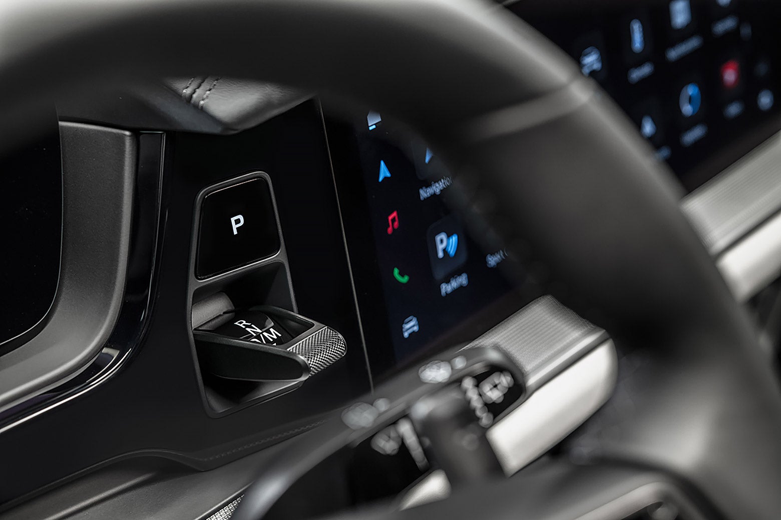
Subaru Ascent Forum banner

Which do you prefer

21 - 40 of 44 Posts
...and restricted use while the vehicle is in motion annoyed me far too much.
I rather like the lock-out feature when the volume is being changed - it allows me to play defense when my passenger(s) is(are) attempting to change the channel on me. :ROFLMAO:
 
Discussion starter · #22 ·
Just remember, the more physical buttons (or dedicated/labeled spots for touch) the less customization and future enhancements you are able to receive.
Yep. A bunch of 2020-2022 Outback owners are beginning to enjoy their OB's because it got the 2023 Outback/Ascent layout (which basically replicates most of the 2019-2022 Ascent HVAC controls in virtual form on screen).

What I didn't like is when Subaru moved stuff from physical buttons to touch, but in a dedicated space. You might as well just left it a button given that dedicated space can never be changed.
I think the advantage there wasn't for us in a usability sense, but for Subaru and us in a cost sense. No more numerous button panels, because each model year had 3-4 different control panels.
 
I can appreciate that, using common control interfaces across lines. One of the reasons I like Subaru is the safety features are almost fully universal on every model (sans manual transmission and some other exceptions - BRZ?).

Is the 2023 screen improved at all? I haven't sat in one, but it appears to be the same glossy screen.
 
Touch screen can lower production cost and help organizing and presenting a large amount of information and features. Thus it is overall a plus for the car industry, provided that they understand its pros and cons. The 23 Ascent is going in the right direction using a combination of screen and switches. I have a few observations so far as a relatively new owner of a 23 Limited with the HK tech package:

1. A good touch screen has to be responsive and yet not too sensitive. The screen in the 23 is a bit laggy, but livable.
2. 23 has knobs for radio volume, tuning, and switches for changing temp up and down, which is smart. Defogger, seat warmer, etc are shown on the front page to make it easier to access.
3. The 23 gives you a fair amount of customization so you can call up the settings easily, without having to find something buried deep in the menu. For the climate control, however, I wish I had a bit more customization. For me personally, once a comfortable temp is set, I almost never change it. However I do like to turn the AC off during those colder days, and I want to be able to hit "Auto" to have the car takes full control so I don't have to mess with the control. But on the front page, you can only select AC or Auto but not both. I don't know the car well enough to know whether the car will stay in auto mode whether the AC is turned on or off.
4. Too many duplicated functions on both the small screen in the instrument panel and the large screen.
5. For Apple CarPlay, I wish the turn-by-turn prompt can be bigger like the way it displays on the phone. May be I just need to get used to it but when I glance at the screen looking for turn-by-turn instructions, my eyes naturally go to the middle and top screen, as I would with my phone, but here it is dominated by in my case the info for the radio. Some say you can use the upper screen to display CarPlay info. Yes, but it does not have as much info as the window in the larger screen. I dont have this issue in my wife's Forester because the turn-by-turn prompt seems bigger. I think this can be tweaked by software. I would like to turn-by-turn window to be proportionally bigger in a larger screen while reducing the map area.
6. For the 23-limited, there are a row of LED lights project Lane-keep assist status to the windshield as opposed to showing up in the little screen in the instrument panel. In the past Lane keep assist disabled what ever else needs to be seen there. This is a smart move by Subaru!
 
1. A good touch screen has to be responsive and yet not too sensitive. The screen in the 23 is a bit laggy, but livable.
** NOTE - the issue for me has always been: 1. One must look at the screen to use it, 2. One must use a certain bit o pressure, 3. Miss because of a bump in the road and the cycle of selection must be fixed, then restarted
2. 23 has knobs for radio volume, tuning, and switches for changing temp up and down, which is smart. Defogger, seat warmer, etc are shown on the front page to make it easier to access.
** NOTE - when I want to turn on my seat warmer, th defogger, etc, why would I want to look at a page, vs simply press the button?
3. The 23 gives you a fair amount of customization so you can call up the settings easily, without having to find something buried deep in the menu. For the climate control, however, I wish I had a bit more customization. For me personally, once a comfortable temp is set, I almost never change it. However I do like to turn the AC off during those colder days, and I want to be able to hit "Auto" to have the car takes full control so I don't have to mess with the control. But on the front page, you can only select AC or Auto but not both. I don't know the car well enough to know whether the car will stay in auto mode whether the AC is turned on or off.
** NOTE - why would I want to customize anything, why not just had real, easy to find, tactile buttons for all of this?
4. Too many duplicated functions on both the small screen in the instrument panel and the large screen.
** NOTE - no issue with duplication (a la how many are there on a computer to BOLD a letter or word. The issue, in this case, is I don't want to use the screen interface for much of anything that is consistently used. Sure, why not on something obscure (radio balance, base, treble, etc)
5. For Apple CarPlay, I wish the turn-by-turn prompt can be bigger like the way it displays on the phone. May be I just need to get used to it but when I glance at the screen looking for turn-by-turn instructions, my eyes naturally go to the middle and top screen, as I would with my phone, but here it is dominated by in my case the info for the radio. Some say you can use the upper screen to display CarPlay info. Yes, but it does not have as much info as the window in the larger screen. I dont have this issue in my wife's Forester because the turn-by-turn prompt seems bigger. I think this can be tweaked by software. I would like to turn-by-turn window to be proportionally bigger in a larger screen while reducing the map area.
6. For the 23-limited, there are a row of LED lights project Lane-keep assist status to the windshield as opposed to showing up in the little screen in the instrument panel. In the past Lane keep assist disabled what ever else needs to be seen there. This is a smart move by Subaru.
 
Touch has to be done right. This means intuitive design, high quality touch surface, possibly automation, and continuous improvement of the UI.

I'm not a fan of the vehicles with heavy buttons and touch. I saw one of the GM and Audi EVs and its button galore as well as touch controls.
That's where every screen in every car I've seen misses-

Touch surface is low quality, scratches so easy. And the CPU seems like they never have enough memory to run at "current gen" pace.

Even with that said, I like the look of only the informant system with no knobs (except for volume and the up and down for heat/cool).
Tesla and Rivian have amazing screens. Its like going from a 2005 capacitive touch PDA to a current gen iPhone/Google Pixel phone.
 
We learned right away in our 20 Outback to customize the icons on the screen so that the ones we use the most are on the bottom where they are easiest to reach. Most of the time I use Radio, Carplay, and XM weather. Sometimes I use the Car Info button just for fun, and that icon is in the center position of the center row. Other than that there really aren't any other icons I use on a regular basis. What this means is there are only three buttons I need, and being able to customize a touch screen to put those buttons where I want is better than having the manufacturer decide which buttons to put where. I duplicated the display on our Ascent to match the layout on our Outback, so no learning curve for whichever vehicle we drive (I updated the software on the Outback to the latest that matches the 23MY Outback and Ascent). This is really no different than we do with our cell phones, but I suspect not everyone has taken the time to customize the screens in their Subaru to their individual liking. In the same way, when people post their instrument display photos, I still see the +/- bar graph at the top instead of customizing it to what you want instead.
 
We learned right away in our 20 Outback to customize the icons on the screen so that the ones we use the most are on the bottom where they are easiest to reach. Most of the time I use Radio, Carplay, and XM weather. Sometimes I use the Car Info button just for fun, and that icon is in the center position of the center row. Other than that there really aren't any other icons I use on a regular basis. What this means is there are only three buttons I need, and being able to customize a touch screen to put those buttons where I want is better than having the manufacturer decide which buttons to put where. I duplicated the display on our Ascent to match the layout on our Outback, so no learning curve for whichever vehicle we drive (I updated the software on the Outback to the latest that matches the 23MY Outback and Ascent). This is really no different than we do with our cell phones, but I suspect not everyone has taken the time to customize the screens in their Subaru to their individual liking. In the same way, when people post their instrument display photos, I still see the +/- bar graph at the top instead of customizing it to what you want instead.
One of the main reasons we bought the 2019 Ascent vs many other alternatives was the use of physical buttons for the entertainment and climate control system and Xmode and AVH.
In my past life, I was in the medical device field where, to release product or software enhancements, the FDA requires successful human factors studies for those changes before they will allow those features to be released to the market. Buttons usually trump single screen controls in those studies but both can be well-designed. The difference is that medical personnel are not trying to change device settings affecting patients while operating a motor vehicle. I find it hard to believe that reducing physical buttons to a large touch screen and taking your eyes away from the road is a safety improvement.
 
We learned right away in our 20 Outback to customize the icons on the screen so that the ones we use the most are on the bottom where they are easiest to reach.....This is really no different than we do with our cell phones, but I suspect not everyone has taken the time to customize the screens in their Subaru to their individual liking.
Yup. That's me, too.

My '21 Touring and my daughter's '19 Legacy (2.5i Limited) have only the "phone"-icon virtual-button on the upper left, and the "settings"-icon virtual button on the upper right. Everything else is moved to the secondary screens. The two vehicles are similar enough that we are able to operate the HVAC and other ancillary controls without the need to take our eyes off the road, through proprioception and touch alone.

The wifey's '22 WRX Limited is the odd-person-out, as it utilizes the current-generation large-screen system.

My daughter and I are Wazers, so that screen takes over on the headunit in our vehicles. We prefer to jump through our favorite SXM stations through a combination of the steering-wheel interface and the physical channel back/forward button on the console, for intermediate stations.
 
  • Like
Reactions: Daniel Acosta
I like our Ascent, but the steering wheel alone has at least 14 buttons with countless more on the dash and the knee boards. I don't remember where each one is unless I recently used them. My Tesla Model 3 has a few buttons for things like volume and speed control and it is much easier for me in the Model 3 to get most chores done. Lane keep assist and speed control?-pull down the right lever at the wheel and you are done (and the lane keep is the best I have ever used). The screen is pretty easy to use and no less distracting than looking down for the right button on the Ascent wheel. Many things can be done by a (very good) speech command system. I like the screen much better and I am not a 23 year old techie-I'm 78 (bue wioll admit to being something of a techie. My wife is not a techie and is a coupleof years younger gets along well with the Model 3. I have not seen the '23 Ascent yet. (And when I am parked I can use the screen as a browser and watch Netflix without paying data charges).
 
^ I think this is very interesting - and that while it stands-out here as perhaps an outlier within our cohort, the typically biased and internally-amplifying nature of Forum and similar social-media platforms may simply mean that the rest of us are instead the outliers, kinda like with many other concerns which many of here share. 😅

I also remember lamenting the arrival of the multifunctional steering wheel, which was, IIRC, a trickle-down from high-end European makes starting from the early 90s. Much like how the teenage me wanted so badly to have the then-new HID headlamps on my low-tier ride, I also desperately sought to recreate those omnipotent steering wheels in high-end vehicles with things like aftermarket steering-wheel rim-mounted ("strap on") head-unit remotes...which, believe it or not, are still available today.

Fast-forward a few years and as steering wheel controls become more popular, I decide instead that I like my wheel unadorned and uncomplicated -I fancied myself a driving purist, with an uncluttered wheel and a 5MT at-hand, in a souped-up family sedan, out of all things :ROFLMAO::geek:- and instead of taking that opportunity to retrofit my 2005 Legacy's steering wheel with auxiliary headunit controls as I upgraded to a really spendy JDM steering wheel (DAMD - https://www.kamispeed.com/collections/damd) I decided to kept it plain.

But I gotta admit that, today, I'm a convert - I really prefer the convenience of steering-wheel mounted auxiliary controls. Unlike @Andy1 , I find that it's really easy to engage the switchgear without having to take my eyes off the road (or, in many cases, without even having to adjust my hand placement on the wheel) - and in a manner that surprised myself as I made the transition between my '05 LGT to the four-button setup on the '13 Tribeca and then my '16 Outback limited -with each step seemingly exponentially increasing the button-count on the steering wheel spokes- I begrudgingly adapted...and eventually came-to-terms with their -in my view- benefits and conveniences.

And while I've always been afraid that during the course of normal daily driving that I'd inadvertently trigger some functionality which I did not desire, I honestly can't say that it has happened to me, yet. Even with the few instances of truly emergency maneuvers I've had to do in the last decade or so since I've had vehicles with steering-wheel controls, I can't recall a single instance when I've managed to activate/deactivate or otherwise modify a vehicle setting, unintentionally.

It's always interesting to see an alternative viewpoint, and towards that, I also think it's quite possible that a truly well-designed system of virtual buttons can not only make us all happy, but can actually enhance our enjoyment of the vehicle, too.

And based on how my own attitudes have changed -from not only having buttons on my steering wheel to my "you'll have to drag my dead body and pry it from my cold hands" move from my beloved Nokia brick-phone to modern smartphones- I'd be willing to bet that if the right interface came along, I'll be OK with a digital dash, too.
 
  • Like
Reactions: Subalu and Andy1
It's always interesting to see an alternative viewpoint, and towards that, I also think it's quite possible that a truly well-designed system of virtual buttons can not only make us all happy, but can actually enhance our enjoyment of the vehicle, too.
Car at its core is a tool to take us from point-A to point-B, and during road trips to offer a place to relax. Thus, fundamentally for the vast majority of the users and usage scenarios, a car with a clean, zen-like interior is preferred over a car that looks like the cockpit of a fighter jet. The latter may be more appropriate for a sports car, however.

As the car becomes ever more sophisticated, electrification is inevitable, such that the car can fully assist the driver in the control of throttles, braking, environment, sounds, lighting, suspension, steering ... etc. iPhone's touch screen was designed to allow a sophisticated pocketable computer to be as simple to use as possible, and drove Black Berry's keyboard oriented UIs out of business. Using a touch screen interface, it also makes it very easy to design controls (app) for a vast majority of features. For our smartphones, it is now not only a phone, but also a watch, camera, music players, computers, ...etc. To make each of the feature we want available with a physical control will make the car horribly cluttered and expensive to make.

In my opinion, a Touch interface is here to stay, if we want our car to become more and more "smart." So the question is not whether we need a touch screen, but HOW to make it work better. "Virtual" assistants exist in the smartphone world to simplify how we use the phone, and the car makers can make that work better. To control temperature, one can already say "raise the temperature" in Ascent, but more features should be available for voice-control, and the system has to be smart enough to understand basic conversation. How about a voice command for "car wash" to automatically disable many Eye Sight related features? Another way to simplify the use of a Touch-based interface is to group functions together as an icon or Widgets, or App as appeared in the phone. One can make this even better to allow customization. To this end, Ascent is moving in the right direction in the 2023 model year. Finally before a digital interface is smart enough, some physical buttons that are smartly designed could be very helpful.
 
^ I ninja-edited that post of mine you'd quoted, @bdjfywi4$ - of which your reply came only seconds before I hit the submit key for my quick, end-of-post edit.

I came back to that post of mine because after having stepped away from it for a few minutes, I realized the following:

...based on how my own attitudes have changed -from not only having buttons on my steering wheel to my "you'll have to drag my dead body and pry it from my cold hands" move from my beloved Nokia brick-phone to modern smartphones- I'd be willing to bet that if the right interface came along, I'll be OK with a digital dash, too.
I absolutely agree with you. :)
 
  • Like
Reactions: Andy1 and bdjfywi4$
Something which is maybe not clear to those who have not driven a Tesla, the "gear shift" is also the cruise control. Due to the lack of actual gears and the mutually exclusive nature of cruise control and direction of travel, the one user interface is double duty.

Tesla also just updated one of the unlabeled scroll wheels on the steering wheel. Long press on the left wheel is now user definable. While minor, a pretty novel update to enhance the experience. Certainly not possible when manufacturers force a fixed feature by way of a label.

Simplification of cars is allowing simplification of the UI while also enabling customization and optimization.
 
Just remember, the more physical buttons (or dedicated/labeled spots for touch) the less customization and future enhancements you are able to receive.
They could place physical controls on the dash, with electronic labels. Thus, the entire interface could be reconfigured very easily.
 
I initially cast my vote for button preference but my reality is going to be challenged in a couple of weeks when my '23 arrives.

I must discharge a lot of energy because in the '20 I can consistently change screen settings just by waving my hand close to the screen. Happens all the time when I touch the up, down or view buttons for the upper display screen. I've made a point to make sure that I'm not barely touching the screen and no, I'm just really close.

I'm planning to install a screen protector immediately if I can find one that fits. Those usually cut sensitivity a bit.
 
21 - 40 of 44 Posts